直接跳至内容部分
The current Eastern Standard Time (EST) is: 2024-11-24 02:06:42 | Hours:02 | day: 7 | Week : Sunday | IsVisible: false
 
loyalty Ninja Rewards Sign up and earn

Earn points
Redeem for discounts.

Join our loyalty program & earn up to 5X points on every order as well as access to exclusive bonuses and promotion rewards.

Start Earning Today

Top 10 DTF Design Tips For Beginners

Imri Jonas Merritt

This guide presents ten essential tips for optimizing your artwork for DTF printing, ensuring your custom apparel stands out with professional-quality results.

From color management and file preparation to leveraging DTF's unique capabilities, these insights will help both novice and experienced designers to produce striking, durable prints that meet the high standards of today's competitive custom apparel market. Here are our top 10 DTF design tips to help you maximize the impact of your custom prints. 

Table of Contents

  • 1. Choosing File Types
  • 2. Understanding RGB vs CMYK
  • 3. Design Software Needed
  • 4. Sizing Your Design
  • 5. Removing The Background
  • 6. Using Halftones
  • 7. Maximizing Vibrancy
  • 8. Details, Patterns and Gradients
  • 9. Textures and Distress Effects
  • 10. Universal Design Principles
  • Special Note: Consider Hiring a Professional Designer
  • Elevating Your DTF Designs for Professional Results
1. Choosing File Types

DTF printing requires high-quality files for optimal results. There are two main types: vector and raster. 

Vector files (AI, EPS, PDF, SVG) use mathematical formulas to create shapes and lines, allowing infinite scalability without losing quality. They're ideal for logos, text, and illustrations with sharp edges.

Raster files (PSD, PNG, JPG) consist of pixels - tiny colored squares that form an image. Their quality depends on resolution, measured in DPI (dots per inch). For DTF, use 300 DPI at the intended print size to ensure clarity.

Always choose vector files when available. They provide crisp, "hard edges" essential for professional prints and can be easily converted to raster if needed. The reverse isn't true–you can't convert low-quality raster to vector without recreation.

If you must use raster files, ensure they're high resolution. Low-quality images will result in blurry, pixelated prints, especially when enlarged. For best results, recreate low-quality raster images as vectors or obtain higher-resolution versions before printing.

2. Understanding RGB vs CMYK

When designing for DTF, color management is crucial. Your screen displays colors in RGB (Red, Green, Blue), an additive color model that produces vibrant, luminous hues. However, DTF printers use CMYK (Cyan, Magenta, Yellow, Key/Black), a subtractive model with a more limited color range.

This difference can lead to unexpected color shifts in your final print. Bright neons and vivid blues in your RGB design might appear duller when printed in CMYK. To avoid disappointment, always preview your design in CMYK mode before finalizing.

Design in RGB for maximum creative flexibility, but regularly preview your work in CMYK. Be aware that some colors (like specific brand colors or Pantones) may be out of CMYK's reproducible range. Consider adjusting your design or consulting with your printer about alternative solutions in these cases.

Remember, what you see on screen is not always what you get in print. Manage your expectations and those of your clients by understanding these color mode limitations of CMYK printing.

3. Design Software Needed

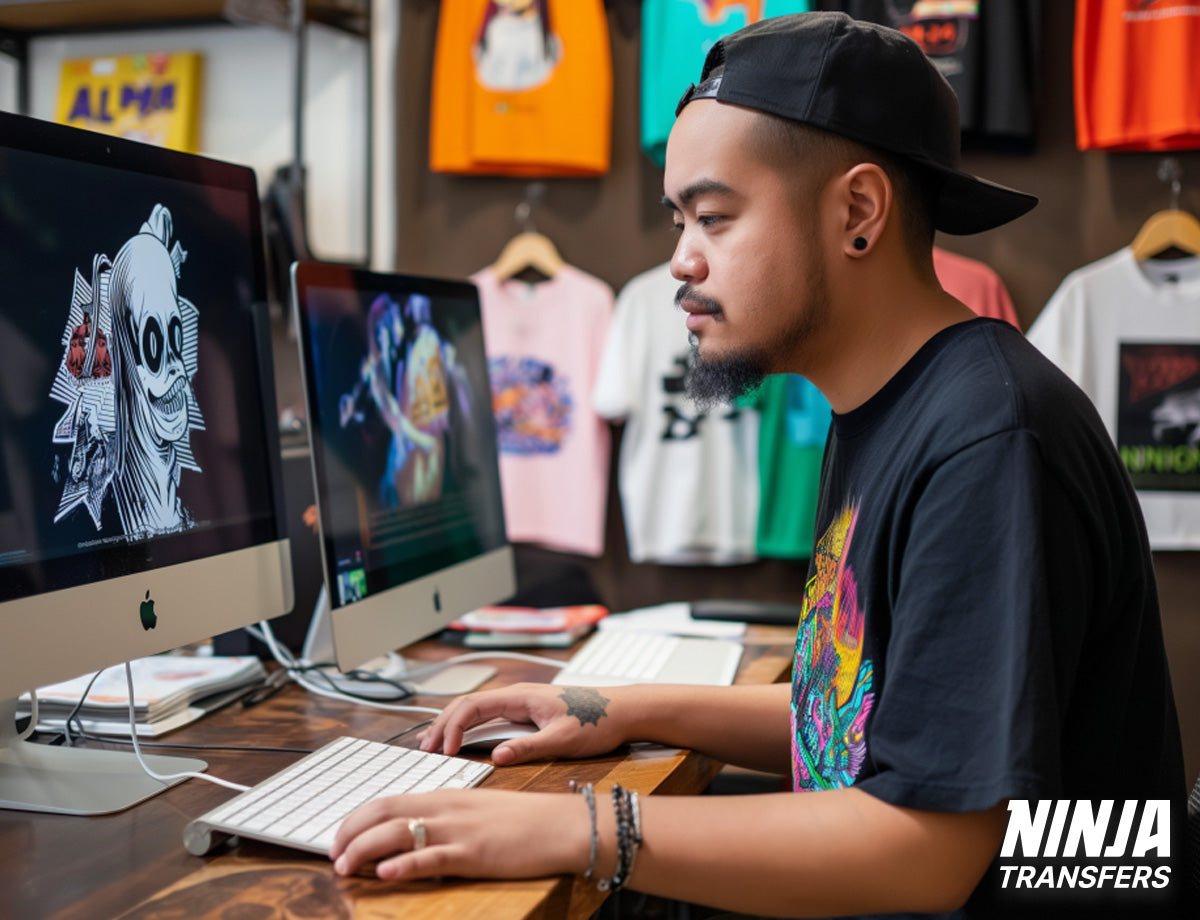
Choosing the right design software is crucial for creating high-quality DTF prints. Your options range from user-friendly apps to professional-grade tools, each suited to different skill levels and needs.

For beginners, web-based platforms like Canva or Adobe Express offer intuitive interfaces and pre-made templates, making it easy to create professional-looking designs quickly. These are perfect for those just starting out or needing simple designs.

Intermediate users might consider Affinity Designer or Photopea. These provide powerful capabilities without the ongoing subscription costs of Adobe products, offering a good balance of features and affordability.

For professionals and advanced users, Adobe Illustrator and Photoshop remain industry standards. They offer unparalleled control for creating detailed, high-quality designs, which is particularly important for complex DTF prints and if you want to design t-shirts that sell.

Mobile users have options too. Procreate on iPad is excellent for hand-drawn artwork, while Adobe Photoshop Express and PicsArt offer on-the-go editing capabilities.

Remember, vector graphics software (like Illustrator or Affinity Designer) is ideal for scalable designs, while raster-based programs (like Photoshop) excel at detailed photo editing and manipulation. Choose the right software for you based on your design needs and skill level. 

For a detailed breakdown, check out our comprehensive guide to the best design software for DTF prints.

4. Sizing Your Design

Proper sizing is crucial for creating effective DTF prints that look professional and feel comfortable to wear. Here are key considerations:

Moderation is key: Avoid oversized designs that dominate the garment. A more modest size often looks more professional and appealing.

Consider garment size: Scale your design appropriately for different garment sizes, from youth to adult 3XL+.

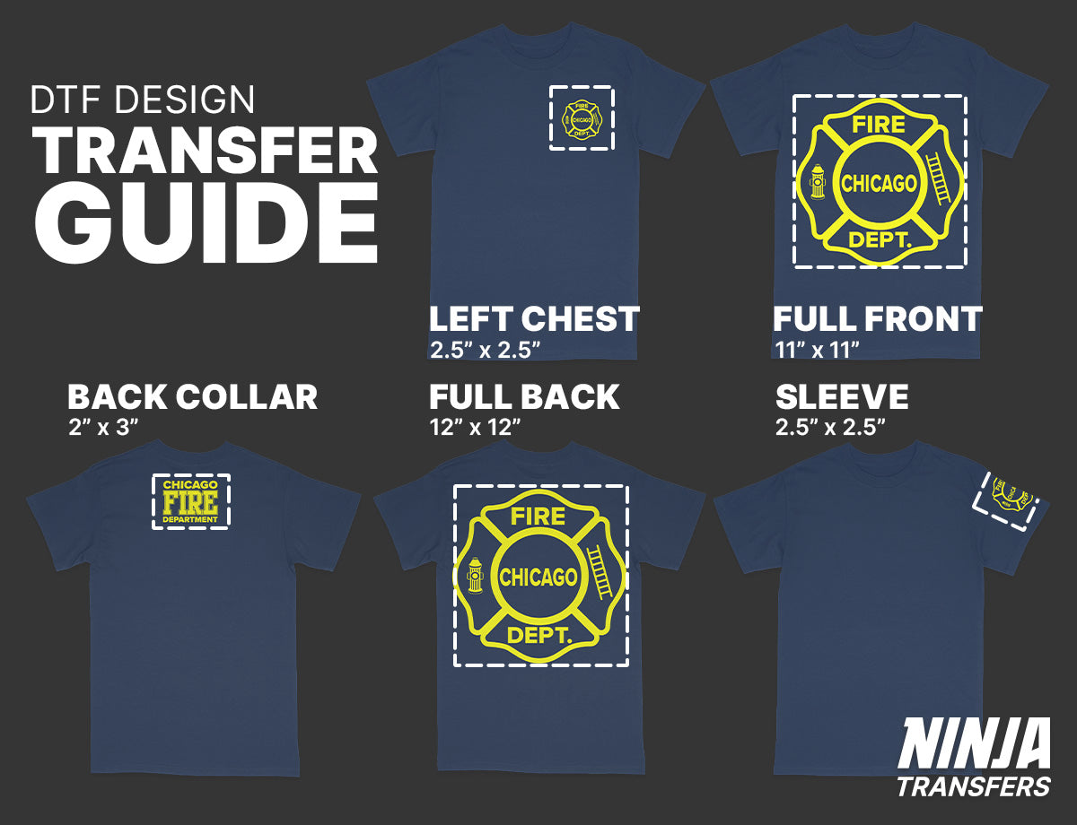
Print placement: Be mindful of standard print locations (chest, full front, back) and how size affects placement.

Breathability: Smaller prints allow for better airflow, enhancing comfort.

Flexibility: Modest-sized prints maintain the garment's natural drape and movement.

Visual balance: Aim for a design that complements the garment rather than overwhelming it.

Graphic quality after enlargement: Take care when scaling up a raster graphic for larger garments, as it can lose some clarity and result in soft edges.

Remember, the goal is to create a print that enhances the garment without compromising its wearability. A well-sized design can make the difference between a shirt that's worn often and one that stays in the closet. For more detailed information, check out our DTF transfer size and placement guide.

5. Removing The Background

Removing the background, or "knocking out" the shirt color, is crucial in preparing DTF designs. This process not only enhances the visual appeal of your print but also improves its wearability. Here's why it matters:

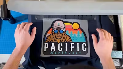
Lighter, more flexible prints: By removing unnecessary background elements, you reduce the amount of ink and adhesive applied, resulting in a softer, more pliable print.

Enhanced breathability: Strategically designed with areas that "show through" allows the fabric to breathe, improving comfort.

Better integration: Designs without backgrounds blend more naturally with the garment color, creating a more professional look.

Avoid the "box" effect: Eliminating solid backgrounds prevents the stiff, uncomfortable feeling of wearing a "big square" on your chest.

While most printing companies (including ours) will remove simple backgrounds for you, consider these tips when designing:

Start with a transparent background in your design software.

Use your garment color strategically in your design.

Incorporate negative space to allow the shirt color to show through.

For photos or complex images, use soft edges or fades instead of hard cutoffs.

Remember, a well-designed DTF transfer isn't just about what you add—it's also about what you leave out. Thoughtful background removal can significantly enhance your printed apparel’s aesthetic and comfort.

6. Using Halftones

Halftones are a printing technique that creates the illusion of continuous tone using dots of varying sizes and spacing. In DTF printing, they're a game-changer for several reasons:

Softer feel: Halftones break up solid areas of ink, resulting in lighter, more flexible, and breathable prints.

Natural blending: They allow designs to fade seamlessly into the garment color, creating a more integrated look.

Enhanced detail: Halftones can add depth and texture to your designs, especially in gradients and photographic elements.

Professional finish: Well-executed halftones can elevate the quality of your prints, making them look more polished and retail-ready.

While creating effective halftones requires some technical know-how, mastering this technique can significantly improve your DTF prints. It's a valuable skill that can set your designs apart in terms of both aesthetics and wearability. Learn how to halftone graphics for DTF transfers with our step-by-step guide.

7. Maximizing Vibrancy

Achieving vibrant, eye-catching colors is crucial for creating impactful DTF prints. Here's why it matters and how to enhance your design's vibrancy:

Visual appeal: Bright, vivid colors grab attention and make your designs more memorable.

Perceived quality: Vibrant prints often look more professional, potentially increasing perceived value.

Brand consistency: Accurate, vibrant colors are essential for maintaining brand identity across products.

Key factors for maximizing vibrancy:

Color modes: Understand the difference between RGB (screen) and CMYK (print) color modes.

File preparation: Adjust levels, contrast, and saturation to enhance color intensity.

Image resolution: Aim for 300 DPI at full print size for best results.

Design choices: Select bold, complementary colors and consider using outlines for contrast.

Remember, while DTF printing is known for vibrant results, proper design and file preparation are key to achieving the best possible outcome. For more detailed advice, check out how to maximize the vibrancy of your DTF prints.

8. Details and fine lines

DTF printing excels in reproducing intricate designs, allowing for a level of detail that surpasses many other printing methods. This capability opens up exciting possibilities for your designs:

Crisp Lines: Create designs with sharp, well-defined lines that are ideal for text, logos, and detailed illustrations.

Intricate Patterns: Incorporate complex, detailed patterns that maintain clarity even at smaller sizes.

Delicate Shading: Achieve subtle gradations and fine shading techniques for more realistic or artistic designs.

To leverage these strengths effectively, keep in mind:

Minimum Size: While DTF handles fine details well, elements smaller than 0.02 inches (0.5mm) may not transfer properly.

Design Check: Use a 0.02-inch circle as a guide when reviewing your artwork. Those areas might not print successfully if they completely overlap any design elements.

Balance: Combine intricate elements with simpler areas for visually appealing and wearable designs.

Remember, most print shops, including ours, will help adjust designs to ensure all elements will transfer effectively. By understanding these capabilities and limitations, you can create designs that maximize the potential of DTF technology while ensuring successful, high-quality prints.

9. Textures and Distress Effects

Adding textures and distress effects to your DTF designs can create a vintage, faded, or weathered look that's highly popular in custom apparel. Here's why and how to incorporate these elements:

Vintage Appeal: Distressed designs give t-shirts a lived-in, vintage feel that many customers love.

Softer Prints: By breaking up the solid areas of your design, textures and distress effects reduce the overall ink coverage, resulting in a softer, more comfortable print.

Visual Interest: These effects add depth and character to your designs, making them more visually engaging.

How to incorporate textures and distress effects:

Use Online Resources: Many websites offer downloadable texture and distress files that you can easily incorporate into your designs.

Layer Textures: In your graphic software, overlay texture files on your design, adjusting the opacity for the desired effect.

Create Worn Edges: Use eraser tools with textured brushes to create worn or frayed edges on your design elements.

Halftone Effects: Incorporate halftone patterns to simulate age or wear, especially effective for gradients or shading.

Strategic Placement: Apply distress effects strategically to enhance the design rather than overwhelm it.

While adding these effects, ensure that no crucial design elements become too faint or broken up to transfer properly. The goal is to create a balanced, intentionally weathered look that still prints clearly and effectively.

10. Universal Design Principles

While DTF printing offers incredible possibilities, the success of your designs ultimately relies on your grasp of fundamental design principles. Investing time in these areas can dramatically improve your designs:

Composition: Learn how to arrange elements effectively, create visual balance, and guide the viewer's eye through your design.

Typography: Understand font selection, pairing, and layout to ensure your text is both readable and visually appealing.

Color Theory: Master using color wheels, complementary colors, and color psychology to create impactful designs.

Branding: Grasp the essentials of creating consistent, recognizable brand identities across different products.

Visual Hierarchy: Learn to emphasize key elements and organize information to enhance communication.

Negative Space: Understand how to use empty space effectively to create cleaner, more professional-looking designs.

These principles apply across all design fields and will elevate your DTF prints from good to great. Consider taking online courses, reading design books, or practicing regularly to hone these skills. Remember, great printing starts with great design; mastering these fundamentals will set your work apart in the competitive world of custom apparel and help you grow your business.

Additional Note: Hiring a Professional Designer

Hiring a designer can be a cost-effective solution if you're not confident in your design skills or don't want to invest in professional software. Here's why:

Expertise: Professional designers have the skills, knowledge, and experience to create eye-catching, effective designs.

Time-saving: A designer can quickly produce high-quality work, allowing you to focus on other aspects of your business.

Software access: Professionals have access to and expertise in industry-standard software, ensuring your designs are print-ready.

Cost-effective: The investment in a professional design often pays off in better-selling products and a more professional brand image.

Where to find designers:

- Fiverr (fiverr.com): Wide range of designers at various price points.

- 99designs (99designs.com): Run design contests or work directly with designers.

- Upwork (upwork.com): Freelance platform with many experienced designers.

- Behance (behance.net): Showcase platform to find and contact designers directly.

Prices can range from $20 for simple designs to $200+ for more complex work, depending on the designer's experience and the project's complexity. Remember, a well-designed product is more likely to sell, potentially offering a great return on your investment in professional design services.

Elevating Your DTF Designs for Professional Results

Mastering these top 10 DTF design tips will significantly enhance the quality and appeal of your custom apparel. From understanding color modes and file types to leveraging DTF's unique capabilities for detailed patterns and textures, these principles will help you create stunning, professional-quality prints.

Remember, great DTF printing starts with great design. Whether refining your skills or partnering with a professional designer, the key is continually learning and experimenting.

At Ninja Transfers, we're committed to helping you achieve the best possible results with your DTF designs. Our state-of-the-art printing technology and expert team are ready to bring your creations to life with vibrant, durable, and comfortable prints. Whether you're a seasoned designer or just starting out, we're here to support your custom apparel journey every step of the way.

 Ready to see your designs transform into high-quality DTF prints on high-quality blank apparel? Explore our services at Ninja Transfers and take your custom apparel to the next level.

Related Content