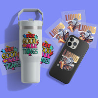
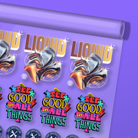
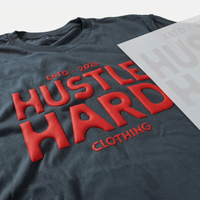


Vibrancy has always been a holy grail of printing. While DTF technology has already achieved eye-popping results compared to other print methods like DTG, there's always room to push the boundaries and make your prints even more stunning.
The key to unlocking the full potential of your prints lies in a few crucial areas: color settings, design preparation for the DTF file, and smart techniques. Whether printing your own transfers or ordering from Ninja Transfers, optimizing your designs for maximum vibrancy starts well before the ink meets the film.
This guide shares our top five expert tips to help you enhance your design files to print DTF transfers that burst with rich, vivid colors. By understanding these principles of design preparation, you can take your prints from great to incredible. Let's get started.
Table of Contents
- Understand Color Modes
- Adjust Levels
- File Types
- Image Resolution
- Design Choices
- FAQs
- Conclusion: Bring Your DTF Prints to Life

Here are our top five tips for achieving stunningly vibrant results:
1. Understand Color Modes
The difference between RGB and CMYK color modes is the primary reason your DTF prints might not look as vibrant as on your computer screen.
RGB vs. CMYK
RGB (Red, Green, Blue) is an additive color system for digital screens. It creates colors by adding varying intensities of red, green, and blue light, resulting in a wide range of vivid hues, including bright neons. This extensive color gamut is why your designs look so vibrant on screen.
CMYK (Cyan, Magenta, Yellow, Black) is a subtractive color system used for printing. It creates colors by subtracting light, which can result in duller, less vibrant hues compared to RGB. When your designs are converted from RGB to CMYK for DTF printing, some colors may appear less vibrant or slightly different than what you see on your screen.
Most design software allows you to switch between the different color modes.

Don't Convert to CMYK
A common mistake is converting your design files from RGB to CMYK in your graphics program. While it might seem logical to convert your files before sending them for printing, you don't need to. This can limit the color gamut and result in less vibrant prints.
For best results in DTF printing:
- Work in RGB mode to take advantage of the wider color gamut.
- Preview the design in CMYK mode to see how DTF colors will shift when printed.
- Save your DTF files in sRGB (standard) format and let professional-grade RIP software handle the conversion to CMYK for optimal color reproduction and vibrancy.
|
Note: If your design is in vector format and started in CMYK mode, you can submit it without converting to sRGB to maintain color integrity more closely. If your design is in raster format and CMYK mode, you can convert it to sRGB before adjusting the levels. |

2. Adjust Levels
One of the most effective ways to enhance the vibrancy of your DTF prints is by adjusting the levels in your design files. These adjustments directly impact how your DTF colors will appear once printed.
Brightness, Contrast, Levels, & Curves
Adjusting brightness and contrast can enhance your design's appearance, but using levels and curves provides more precise control:
Brightness: Modifies the overall lightness or darkness of your image. Increasing brightness can make colors pop, but overdoing it can wash out details.
Contrast: Adjusts the difference between the lightest and darkest areas, adding depth and making colors appear more vivid. However, too much contrast can distort the color balance.
Levels: Fine-tunes shadows, mid-tones, and highlights, enhancing the tonal range and boosting overall vibrancy.
Curves: Provides even more control over tonal adjustments, allowing for subtle changes to brightness and contrast without affecting the entire image uniformly.
Color Adjustments
Graphics software offers various tools to tweak color properties and make your design come alive. These two adjustments give you strong control over vibrancy:
Vibrance: A subtler adjustment that boosts the intensity of less-saturated colors more than already-saturated ones, enriching the overall color without overpowering the image. Vibrance can often be increased by 50% or more without looking unnatural.
Saturation: Intensifies all colors. Overdoing it can lead to unrealistic or gaudy results, so apply carefully. Depending on the image, you may only be able to add 10–20% before colors start “blowing out.”
|
Pro Tip: Start with vibrance to add richness without drastically shifting color, then use saturation sparingly to avoid oversaturation. |

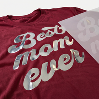
Rich Blacks
Saturated blacks are essential to a print's overall vibrancy. A "rich black" combines different amounts of CMYK to create a deeper, more dynamic black than using black ink alone.
For vector files, adjust black parts using CMYK sliders to add a mix of other colors, making them richer and fuller. Be careful not to max out all four inks, as this can cause bleeding during printing.
For sRGB raster images, adjust levels to ensure fully saturated blacks while keeping midrange tones vibrant. As a final adjustment, you can also use "Selective Color" to add other colors to black.

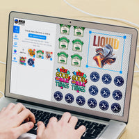
3. File Types
The file type you submit for printing can significantly impact your final DTF quality and vibrancy. Different file types have varying levels of detail and flexibility, and choosing the right one is crucial for achieving sharp, vibrant prints.
Vector vs. Raster
There are two main file types, and they are vastly different. Ninja Transfers accepts all types for DTF files, but vector is always preferred. Raster art should be at least 300 DPI.
Vector files (AI, EPS, PDF): Defined by mathematical points and paths, vector files can be scaled infinitely without losing quality. They're ideal for logos, solid colors, text, and design elements requiring sharp, clean lines. Remember that vector graphics can contain spot colors that are not reproducible with CMYK printing. Preview the file in CMYK mode to anticipate the color shift.
Raster files (JPEG, PNG, TIFF): Composed of pixels, raster files are best for detailed DTF images and photographic elements. These image files can be adjusted with countless tools and filters. However, quality is tied to resolution, and scaling up can reduce clarity and vibrancy.

Choosing the Right DTF File Type
When selecting a file type for your DTF prints, consider the following:
- Use vector files whenever possible, especially for designs with solid colors, text, or sharp lines. They provide the best DTF quality and maintain vibrancy at any size.
- Choose high-resolution formats like PSD, PNG, or TIFF if you use raster files. These typically preserve quality better than heavily compressed JPEGs.
- Avoid using GIFs, as they are limited to 256 colors and not suitable for high-quality DTF prints.
4. Image Resolution
Image resolution, measured in DPI (dots per inch), is crucial for achieving sharp, detailed, and vibrant DTF prints. Higher DPI means more detail, while low-resolution DTF images can result in blurry, pixelated, or color-poor prints that detract from the desired vibrancy.
Recommended Resolution for DTF Transfers
For the best results with DTF transfers, we recommend using images with a resolution of 300 DPI at the full intended print size, with a minimum of 200 DPI.
300 DPI: The industry standard for high-quality printing. Ensures crisp details and vibrant DTF colors, even at larger sizes.
200 DPI: The minimum acceptable resolution for printing. Suitable for smaller designs or less detailed prints but may not capture finer details as sharply as higher resolutions.

Upscaling Low-Resolution Images
Low resolution is a common problem in DTF printing, especially when images come from smartphones or internet sources. These images often have lower DPI settings suitable for screens but not high-quality printing—high resolution = high-quality print.
If you only have a low-resolution image and need to resize it larger, most graphics software will interpolate (guess) the additional pixels, softening edges and reducing clarity and vibrancy. The Ninja Transfers art department is always here to help optimize your files and even recreate them if needed.
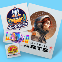
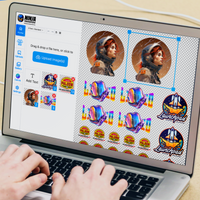
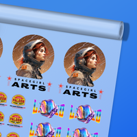
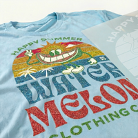
5. Design Choices
Even with perfect color settings, adjustments, and file types, the design itself plays a crucial role in the vibrancy and impact of your DTF prints. Thoughtful design choices can elevate your artwork and make colors pop, ensuring your design stands out.
Color Selection
The colors you choose are fundamental to how your DTF print will appear:
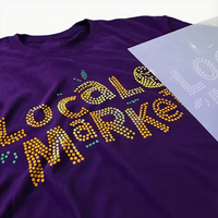
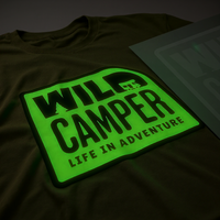
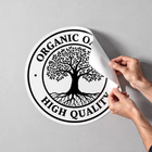
Bold colors: Primary (red, blue, yellow) and secondary (green, orange, purple) colors tend to be the most vibrant and eye-catching, standing out prominently on various backgrounds.
Complementary colors: Pairs of colors opposite each other on the color wheel create striking contrasts that can make your design pop (e.g., blue with orange or red with green).
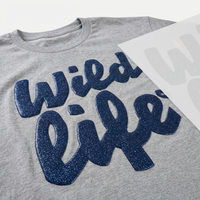
Beware muted and dark colors: Browns, navy, charcoal, and army green tend to appear less vibrant and are often used for more subdued looks. If your design relies on these hues, consider brighter accents or complementary elements to boost contrast and energy.
Simplify the Design
In printed formats, simple designs can deliver a powerful visual punch, as clarity and sharpness are crucial:
Focus on key elements: Identify and emphasize the most important parts of your design, such as a central image, logo, or text.
Reduce clutter: Remove unnecessary details that don’t contribute to your message or aesthetic. This improves legibility and impact.
Use negative space: Empty space can highlight key elements and create a cleaner, more professional look.
Bold Outlines
Incorporating bold outlines adds contrast and helps elements stand out:
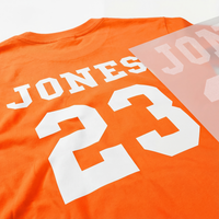
Outlines for contrast: A thicker outline creates a clear boundary around elements, making them pop against the background—especially helpful for detailed designs.
White outline: A white outline can be a game-changer on darker garments, improving visibility and creating a dynamic “sticker” look if that’s your style.

Conclusion: Bring Your DTF Prints to Life
Creating vibrant and eye-catching DTF prints is a combination of art and science. By understanding and applying the principles of color settings, image adjustments, file types, resolution, and design choices, you can significantly enhance the DTF quality and vibrancy of your prints—bringing your designs to life with stunning color and clarity.
Achieving professional-grade results with your own printer can be challenging and time-consuming. That's why we offer expertly prepared, pre-printed DTF transfers optimized for maximum color vibrancy. Our advanced printing technology ensures that your designs stand out, whether you need individual transfers or gang sheets.
Let us help you take your DTF prints to the next level and make your designs pop with unmatched brilliance and clarity. Trust Ninja Transfers and Ninja Blanks for all your custom apparel needs and experience the difference that expertly crafted, vibrant DTF prints can make.

FAQs
Why Is My DTF Transfer Blurry?
Blurriness in transfers is usually caused by low-resolution images or excessive compression. If your design file was scaled up from a smaller image without maintaining the necessary pixel density (DPI), the result can be a blurry print due to softened edges, pixelation, and reduced clarity.
To avoid blurry transfers:
- Start with high-resolution images. To preserve detail and sharpness, ensure your original file is at least 300 DPI at the intended print size.
- Use the Sharpen filter in your graphics editing program.
- Use vector files when possible. Vector graphics can be scaled to any size without losing quality. Formats like AI, EPS, or PDF are ideal.
- Consult with our art department. If you’re unsure about file quality, the Ninja Transfers team can help optimize your files. For best results, start with high-resolution or vector artwork.
How Can I Make My DTF Transfers Brighter?
To enhance brightness and vibrancy, adjust the following:
- Brightness & Contrast: Brightness increases overall lightness, while contrast sharpens the difference between light and dark areas.
- Levels: Improves tonal range, making whites purer and darks richer.
- Vibrance and Saturation: Vibrance boosts muted colors without pushing already bright colors too far. Saturation increases all colors and should be used carefully to avoid unnatural results.
Does Shirt Color Affect the Vibrancy of a DTF Print?
For DTF prints, shirt color generally does not affect the vibrancy of the print itself, which is an advantage over print methods like DTG or screen printing, where substrate color can significantly influence the final appearance.
However, fabric texture can affect perceived vibrance. A smoother surface typically produces higher vibrance than a rough or heavily textured fabric. That’s why we often recommend premium t-shirts.
While print vibrancy remains consistent across shirt colors, perceived contrast can vary based on the background. Bright designs look especially striking on light shirts, while dark shirts can reduce contrast if your design includes dark elements.