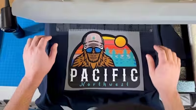


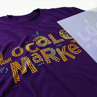

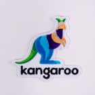

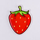


Whether your t-shirt business involves custom apparel or designing shirts that sell, getting your colors right is more than aesthetics–you need to meet customer expectations and build a reputation for quality.
Knowing the difference between the RGB and CMYK color models is your first step to getting there. These nerdy acronyms represent powerful concepts in graphics and printing–and can be harnessed to make sure you get print colors you’re happy with.
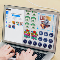
This color mode guide for beginners explains the differences and why they matter for DTF printing, plus some practical tips for adjusting design files. Let's jump in.
Table of Contents
- RGB vs CMYK: What's the Difference?
- Understanding Color Modes
- What Is RIP Software?
- What's the Best Color Mode for DTF Print Files?
- Conclusion

RGB vs CMYK: What's the difference?
The main reason why colors look different on a computer screen vs. how they do on a shirt is the difference between RGB and CYMK color models (or mode). Here’s the short explanation:
RGB is the color mode of screens, from smartphones to computers to digital billboards. RGB is an “additive” color model that creates colors by adding different intensities of red, green, and blue light. RGB can produce those ultra-bright, neon-like colors that make your designs look so brilliant on screen because the monitor essentially backlights the colors.
CMYK, also known as process printing, is the go-to color mode for most printing, including DTF transfers. CMYK is a “subtractive” color model which creates colors by absorbing (or subtracting) specific wavelengths of light. This is why printed colors often appear slightly less vibrant than their on-screen counterparts; they are not backlit by a computer monitor.
What you see on your screen is always in RGB model, even when working in CMYK (or other color modes). Design programs provide a virtual preview of how CMYK colors might look when printed.
What is color gamut?
Color gamut is the full range of potential colors a particular color mode can represent. RGB has a wider gamut than CMYK and can include high-intensity hues and neons, “spot” colors, and specific Pantone. Some of these might be outside CMYK's color gamut and can’t be exactly matched with a DTF print. Other more specialized t-shirt print methods like screen printing are required for an exact match.

Should you convert your design file?
A common misconception is that you need to convert your RGB files to CMYK in your graphics program before sending them for printing. Typically, it's not necessary or recommended. Professional printers like Ninja Transfers use specialized RIP (Raster Image Processor) software optimized for color matching and vibrancy. This software does a much better job of converting RGB to CMYK than most design programs.
Color mode best practices for DTF transfers
- If you're starting a new design, work in RGB mode. This mode allows you to access a broader range of colors and allows for easier editing. If you have a file that is not in either of these two modes (for example, Indexed or Grayscale), switch to RGB as a first step.
- Use HSB (Hue, Saturation, Brightness) sliders for more intuitive color picking and adjustments. This approach can work for both RGB and CMYK modes.
- Preview your design in CMYK mode before finalizing it. This will give you a better idea of how it will look when printed. Just keep in mind that it’s a close approximation and not exact. This is why professional printers use color profiles and calibrated systems to ensure what you see is as close as possible to what you'll get.
- If your design is already in CMYK, converting it to RGB is optional. For example, if you're working with a pre-existing CMYK file, and are happy with the colors, feel free to leave it.
If your goal is to maximize the color vibrancy of your designs, set some realistic expectations by understanding the known limitations of CMYK printing. Let’s take a closer look at the differences between these two color modes and go over some practical tips for getting the best results.

Understanding color modes
While other various color modes exist, RGB and CMYK are the leading players in DTF printing. RGB is for working with art files on the computer screen, and CMYK is the final process used for printing transfers.
What is RGB?
RGB (Red, Green, and Blue) is an additive color mode and the superpower of digital images. It's the native language of screens, from the device you're reading this on to the big screens in Times Square. If you've ever looked closely at an LED screen, you probably noticed that it's all red, green, or blue dots. RGB creates a wide range of colors by varying the intensities of these three lights.
Working with RGB files
When you're designing for DTF printing, working in RGB mode can give you more flexibility and a broader color palette to play with initially. Here are some tips to keep in mind:
- Watch out for spot colors: If you're working with a specific brand color or Pantone shade, be aware that it might not translate exactly in the RGB to CMYK conversion. Consider using a color bridge guide to find the closest CMYK equivalent.
- Boost saturation and brightness: If you’re looking to max out the vibrancy of your print, start with the richest and most saturated colors, because they can only shift down when printed.
- Preview in CMYK: Most design software allows you to preview your work in different color modes. Use this feature to understand how your colors might shift when printed.
- Use sRGB color space: When saving your files, use sRGB color space. It's the standard for web graphics and works well for most printing processes, including DTF.

What is CMYK?
While RGB rules the digital realm, CMYK is the undisputed champion of the print world. CMYK stands for Cyan, Magenta, Yellow, and Key (black). Why 'K' for black? It's called the 'Key' color from the early days of process printing, when they used a different "plate" for each color. The cyan, magenta, and yellow plates were carefully keyed (aligned) with the key plate, which was usually black.
Unlike RGB, CMYK is a subtractive color model. Each color you add subtracts some light that would otherwise be reflected. Include all the colors, and you will get black (or a muddy brown in practice). This is why you need a white underbase for printing on dark-colored shirts.
This subtractive nature is also why CMYK has a more limited color gamut than RGB. Some of the super-bright colors you see on the screen can't be made by mixing cyan, magenta, yellow, and black inks.
Working with CMYK files
When preparing a file for DTF printing, understanding the particulars of CMYK mode can help you create designs that translate beautifully from screen to shirt. Here are some tips:
- Embrace rich blacks: For a deep, vibrant black, don't just max out the K channel. Try a mix like 60C, 40M, 40Y, and 100K for a rich, full-bodied black that won't look washed out.
- Mind your total ink coverage: While it might be tempting to crank up all the colors, too much ink can cause printing problems. Most DTF printers recommend keeping your total ink coverage (the sum of all four CMYK percentages) under 280-300%.
- Watch for color shifts: Some colors can shift noticeably when switching from RGB to CMYK. Bright greens and blues are common culprits. Always preview your designs in CMYK first.
- Use the right profile: If you work directly in CMYK, use the correct color profile for your intended output. Your printer can provide you with the right profile for their equipment.

What is RIP software?
Professional DTF printers, and even small businesses that choose to print their own DTF transfers,use advanced RIP software that does a stellar job of converting your RGB designs to the printer's color space. This software considers factors like the specific inks being used, the printing substrate, and even the individual characteristics of the printer.
You don't have to worry about the conversion process as long as you're not printing your own. Focus on creating vibrant designs in RGB, and let the pros handle the conversion. Just remember to preview your work in CMYK mode to manage your expectations about how the printed product might look.

What's the best color mode for DTF print files?
Generally speaking, keeping it in CMYK is your best bet. Here's why:
-
Print-ready color accuracy: CMYK reflects how colors will actually print, helping avoid surprises when your design hits the press.
-
Control for color-critical work: If your design needs precise color matching—like brand colors or packaging—CMYK gives you the control to hit exact print formulas.
-
Industry standard for print: Most professional print workflows, including offset and commercial digital printing, are built around CMYK files.
-
No unexpected shifts: Converting RGB files to CMYK at the last minute can lead to dull or altered colors. Starting in CMYK helps maintain consistency throughout the process.
That being said, there are some situations where RGB is fine:
-
Digital-first designs: If the project is primarily for web or screens, RGB is more appropriate due to its wider color range and brightness.
-
Creative flexibility: RGB gives access to more vibrant tones, which can be useful during the design phase before converting to CMYK for final print.
-
RIP software handling: Some modern RIP software handles RGB-to-print conversion well, but results may vary depending on the system and ICC profiles used.

Mastering color modes for stunning DTF transfers
Navigating between RGB and CMYK might initially seem daunting, but it's a crucial skill for anyone looking to create stunning DTF transfers. Remember that while RGB gives you a broader palette to play with during the design phase, CMYK is the language of print. The key is to find the sweet spot between creative expression and print limitations.
The best way to master color management is through practice. Experiment with vibrant colors in RGB, but always preview in CMYK to manage your expectations. So fire up your design software, play with those color sliders, and start creating your most vibrant and successful prints yet.
Continue your journey in t-shirt design by learning how to halftone graphics for DTF printing and the difference between vector and raster files.